By Leoni Dimond and Louisa Clark
I carved and watched as some of the excess blew in the wind and returned to the dirt at my feet. It felt like this process had ended in a perfect circle.
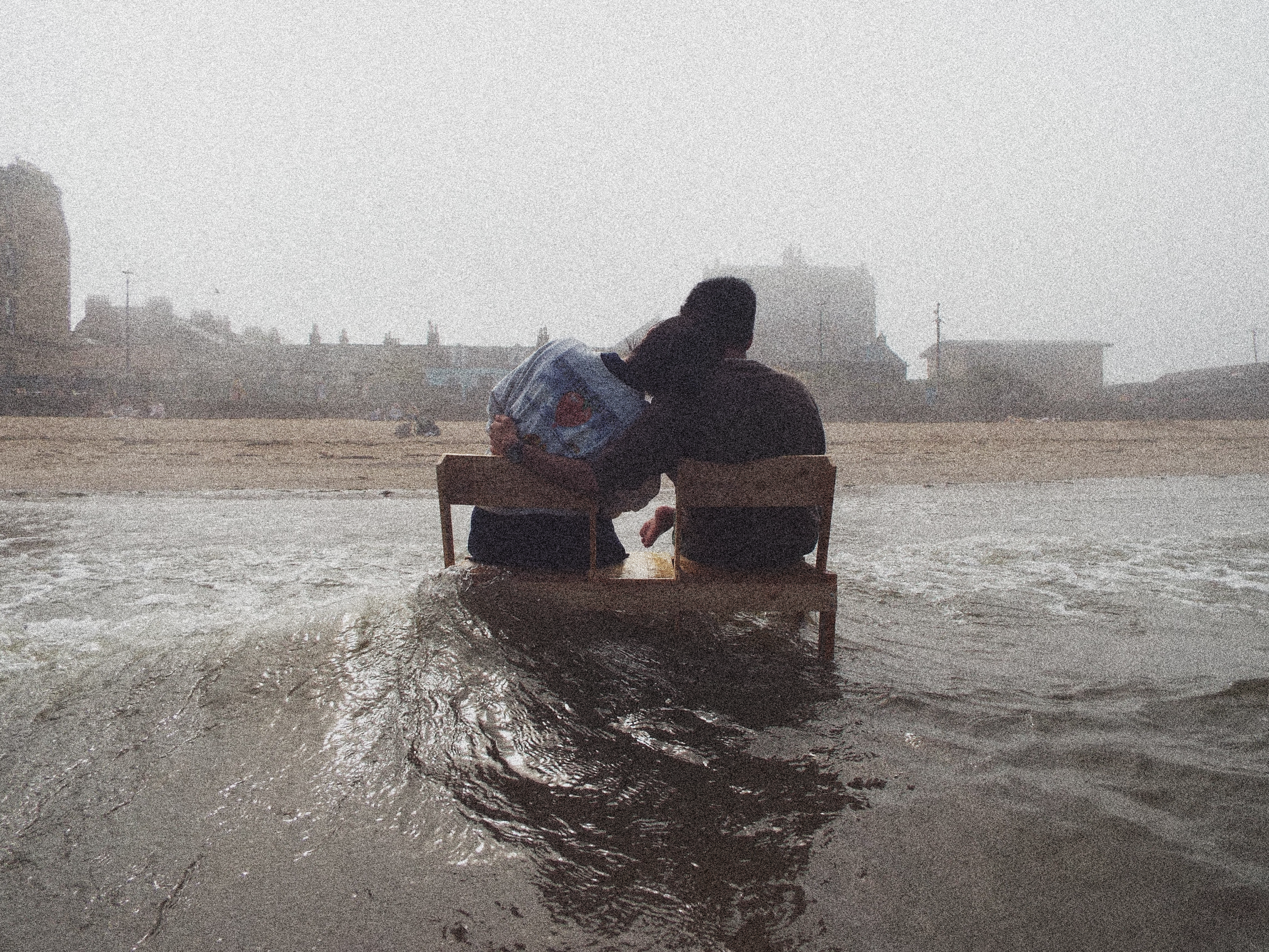
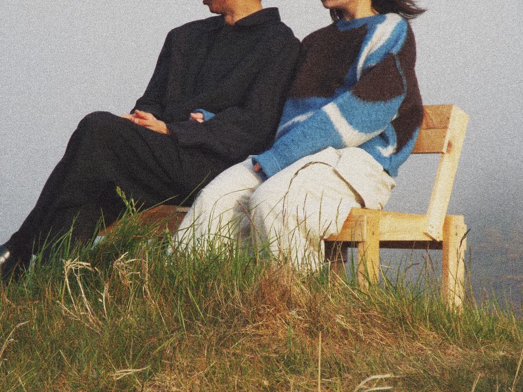
In the summer of 2025, Leoni and Louisa were two of the dozens of participants who took part in the Periplus Workshops. Periplus is a residency focusing on innovation, materiality and sustainability through art and design and with the help of local people and businesses. Set in various locations across the diverse Greek landscape, it is a submersive experience of Greek culture and nature. In 2025 the workshops took place in two locations; first in the mountainous village of Dimitsana in Arcadia; second in the familiar village of Alikianos in Crete.
The process
During the residency with Periplus, myself and Leoni rethought the process of making linoleum plates for print making. The idea emerged a few days into the residency, after a visit from an essential oil alchemist Simos, using his hand built distillery, and a workshop breakdown on bio-material recipes – using both agar agar and potato starch.
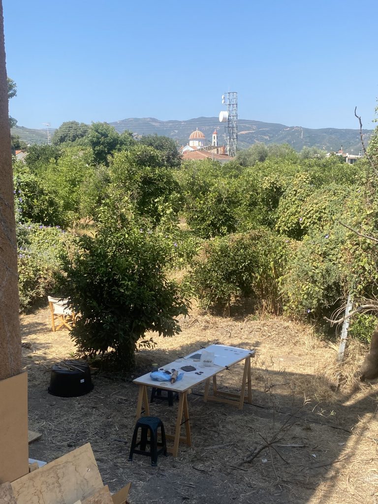
In the afternoon on our outdoor workshop looking over the immense Peloponnese Mountains we got to experimenting with bio-material recipes – another participant (a lot more capable of getting the right ratios) had perfected the recipe using Agar Agar (a plant based gelling product made from red algae) to produce a perfect rubbery cube. My immediate thought was that the cube would be perfect to carve into; and maybe the local clay, grounded up discarded olive pulp, or pounded down concrete rubble would help firm the structure.
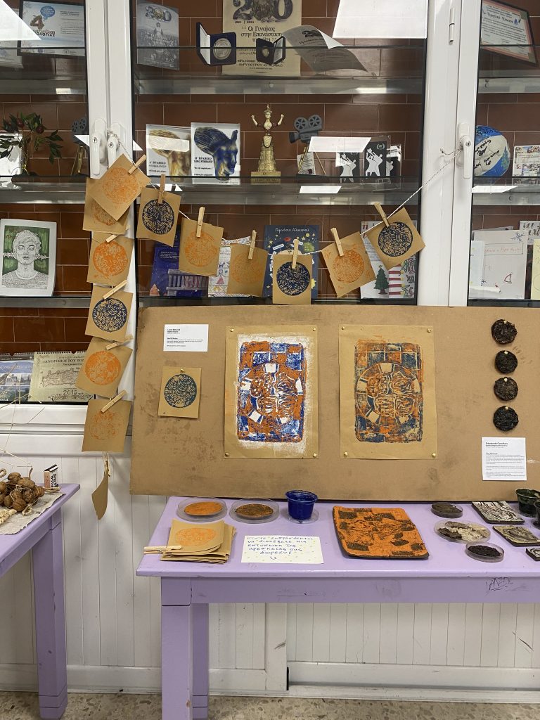
Up until this point in the residency I had been drawn to creating a project with the waste materials at our disposal that was accessible, versatile and portable. Drawing and print making are accessible and versatile mediums, specifically print making, offering endless possibilities for textile repeats and print additions. Given more time, I was interested in collaborating with those making paper, textiles, and furniture all from waste products to merge both ideas. Adapting our friends recipe of the pure agar agar to include primarily recycled material from the local area took a couple of days of trial and error, there were many cracks in the intense heat, some shriveled blocks, and curled corners – but we found a recipe that allowed us to carve, print, and most importantly be a draft for Leoni to prototype in Crete.
An important consideration of the workshops is legacy; what can be designed or ideated which can be passed on, or up, to fellow and future participants. Myself and another participant, Louisa, considered this at the beginning of the first workshop in Dimitsana. After leaving and beginning another round of workshops in Crete, I knew I didn’t want to start a new project. I wanted to work at perfecting the idea which Louisa had started as I knew it had potential to help future participants. I felt at home in Alikianos since I had been here before and felt comfortable to start experimenting straight away.
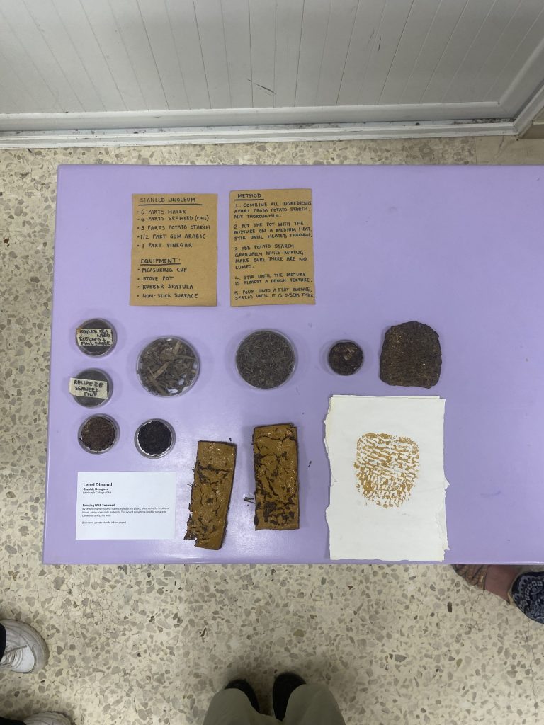
I considered what needed to be improved and came up with three factors: the bio-line needed to be more flexible; it needed to have a smooth and flat surface to carve into; and it needed to stay smooth without cracking over time. I knew these goals would be hard to achieve in the heat so I had to be persistent and make many prototypes. I compared biomaterials which had the most potential from the Material Library with results online. I also tested a total of ten recipes with different ratios of glycerine, agar agar, vinegar and starches. These ingredients bind the biomaterial together to make bioplastic but not all of them need to be present. What defines a successful bioplastic is using as little of these ingredients as possible, and as much of the biomaterial as possible. All of this needs to be considered before considering the benefits and properties of the biomaterial.
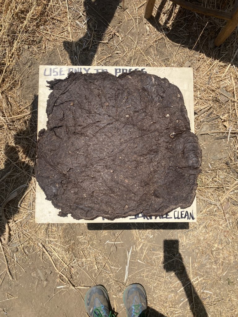
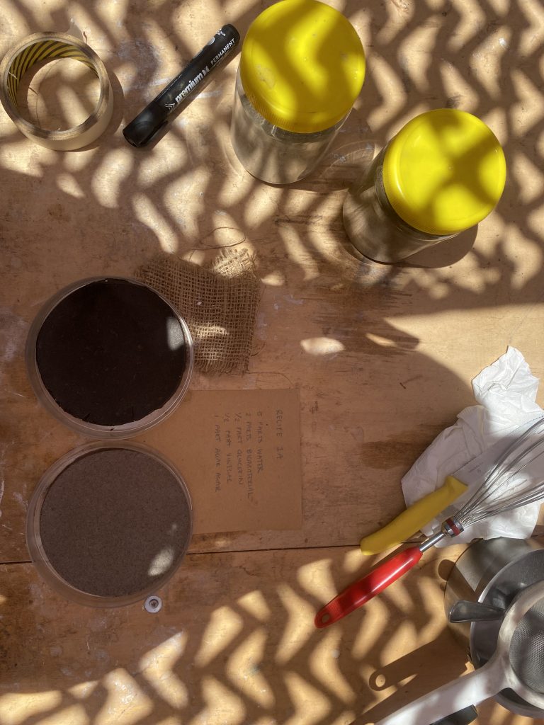
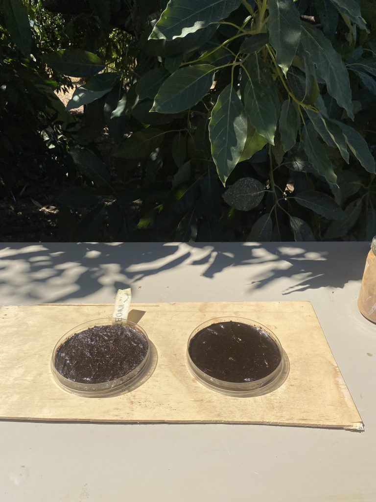
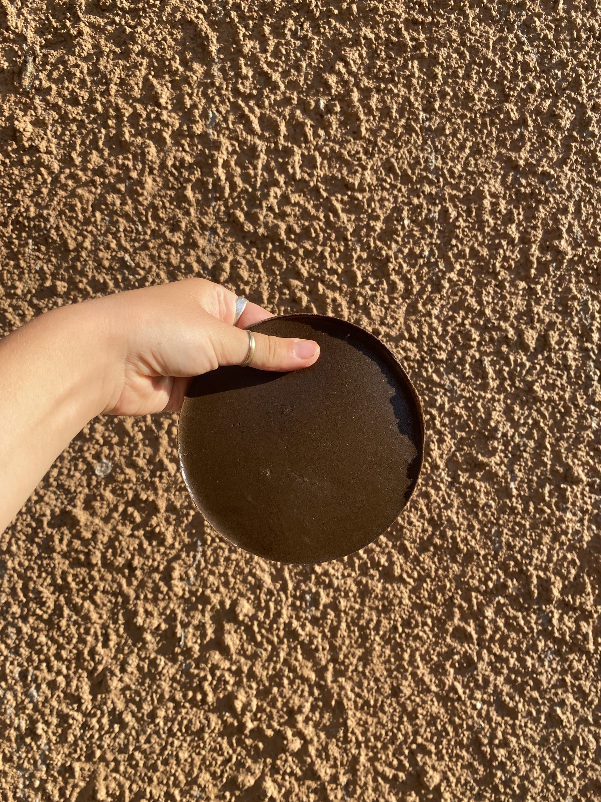
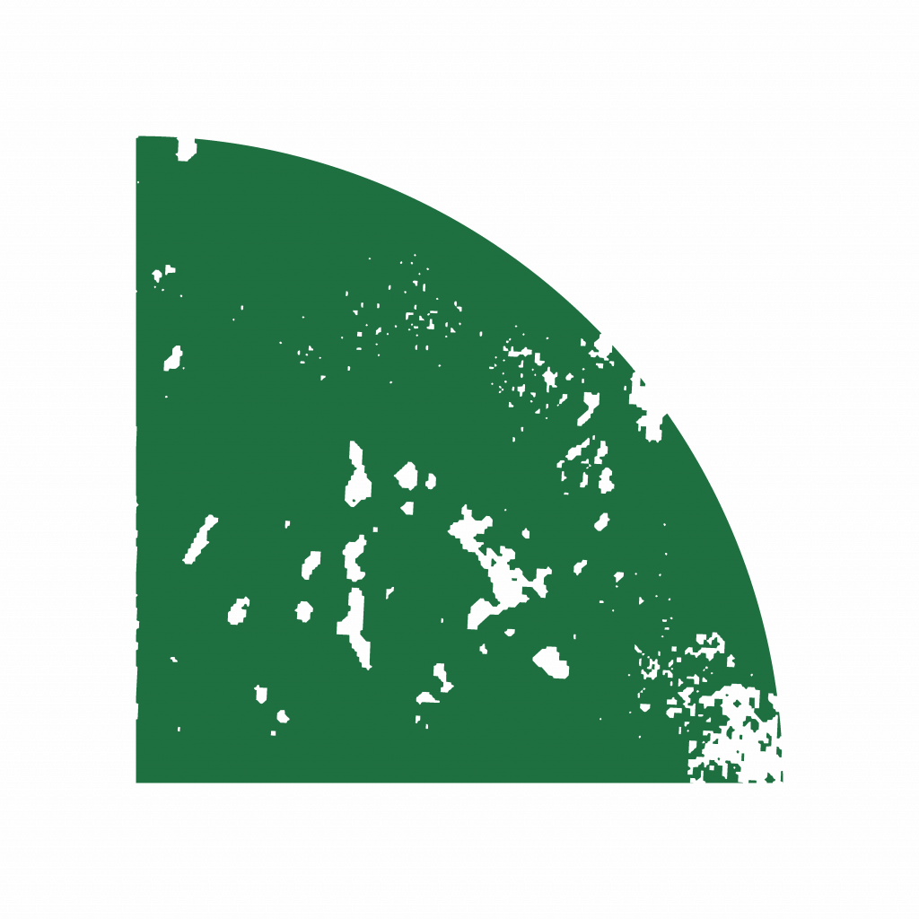
I thought the biomaterials such as orange peel or seaweed would be the most successful since they are flexible and rubbery in their natural form. However they turned out to be too fibrous to make a surface which was both smooth and able to be carved into. I needed to use a material which could be used in high quantities and was fine enough to make a smooth texture. I considered the following mineral materials: diatomaceous earth, attapulgite and marble dust. These materials produced textures on either end of the spectrum; the diatomaceous earth and marble dust created texture far too brittle while the attapulgite – a magnesium aluminium silicate clay powder – created a mouldable, plasticine-like texture.I tested the House Dirt on a whim, thinking how odd it would be if this dirt at my feet achieved what the other materials had failed to do. It had to be sieved to get a finer powder, but this dirt turned out to be the most successful material I had used yet. It could even be used in high quantities with a small ratio of agar agar and still bind successfully. The first test, in a petri dish, had dried completely after twenty minutes in the shade. It could be picked up and bended, with a smooth surface which carved like real linoleum (only with a slightly more gritty texture). I was skeptical that it would be able to be washed and reused. However it passed the final test after I printed with it, washed and reused it many times. I could even carve into it again after it had been washed.
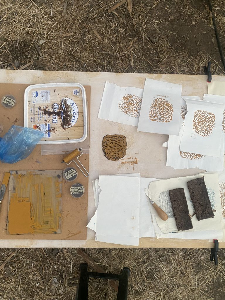
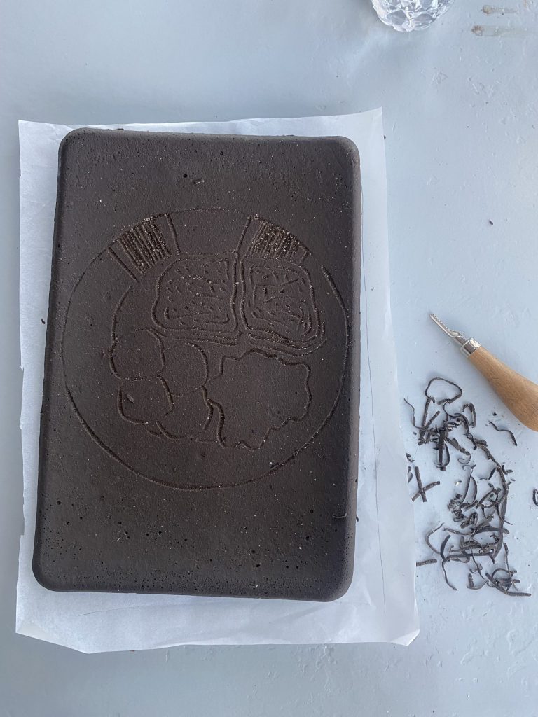
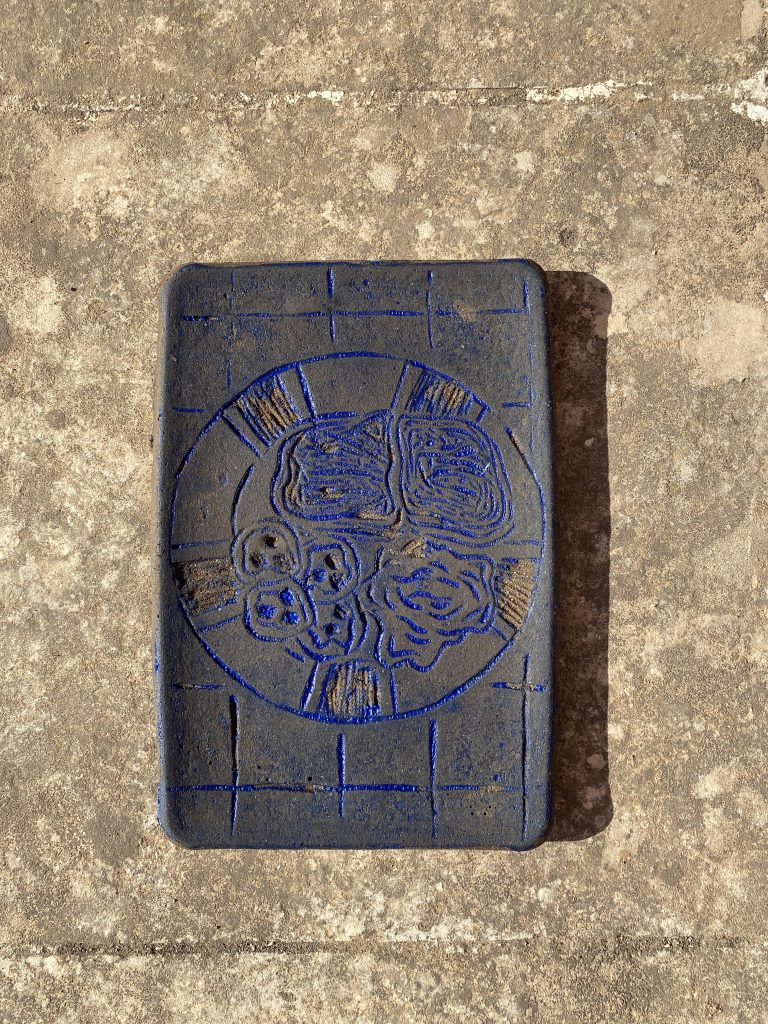
I sat for hours carving into this new material and wondered what could possibly be in this dirt which surrounded the house and was able to create such a useful tool. I carved and watched as some of the excess blew in the wind and returned to the dirt at my feet. It felt like this processhad ended in a perfect circle.


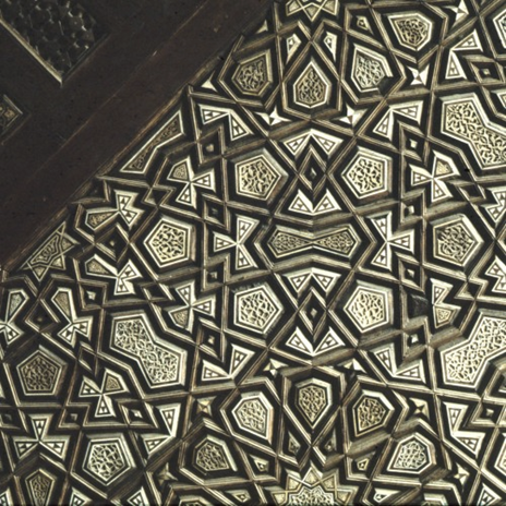
 (in blue) form a pentagon in an