By Leoni Dimond
“Scavenging is not static and its results are always varied. As an act it is uncertain but exciting, inconsistent but always surprising.”
In early 2023, in the ECA cafe, I had my first meeting as part of the ScavCo team. Accessibility, curiosity, open-mindedness, and sustainability were all aims which we hoped to translate into visual communication. We discussed ways to incorporate natural textures and portray the values of the initiative. By forming letters made up of textured pieces, we conveyed the act of Scavenging for materials. In using these pieces as a jigsaw and animating them slotting together, the word Collective was also reflected.
Two years later, we decided it was time for a fresh look. I had two main words in mind. The first was Texture. The lines and segments I had used previously did not convey the feeling of craft that is so strongly associated with our values. I wanted the texture to be recognisable and felt through a screen. I deliberated over a way in which I could maintain a handmade feel, even once it was
digitalised. The second word which came to mind was Versatility. Timeless design is considered the best way to be cohesive and recognisable; and it is far more conventional to have a logo that remains the same over time. However, Scavenging is not static and its results are always varied. As an act it is uncertain but exciting, inconsistent but always surprising. A project which evolves as much as Scavenger Collective needs a design which can be easily moulded to encompass its many forms.
Merging these two thoughts has increased the success of both. By having a less solid shape, this is a logo which can be layered, therefore increasing its versatility. By having a shape which can be combined with other forms, it can create new textures on a screen and in print.
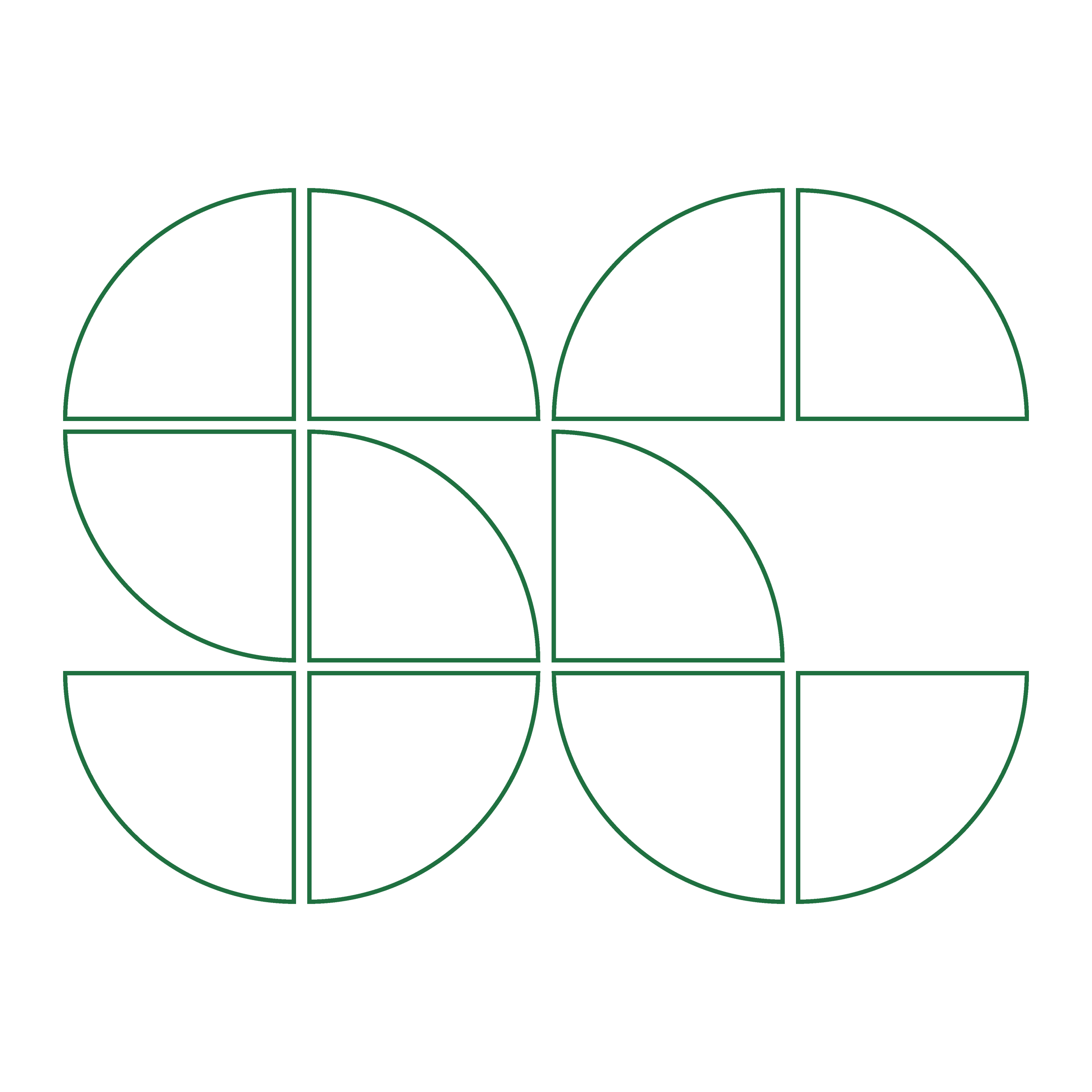

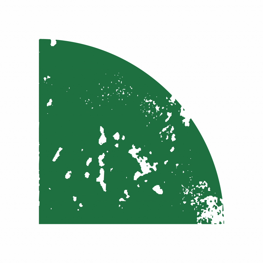
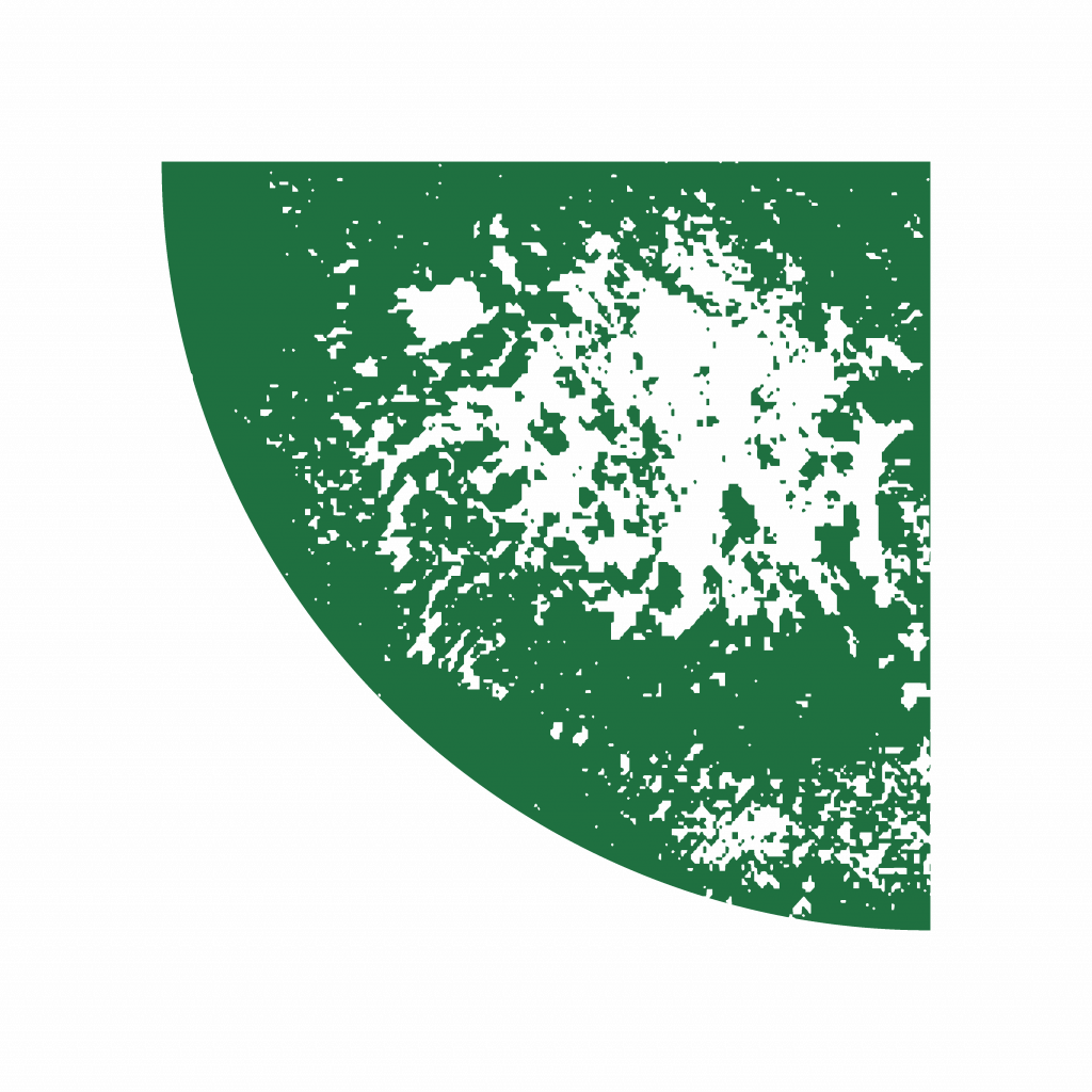
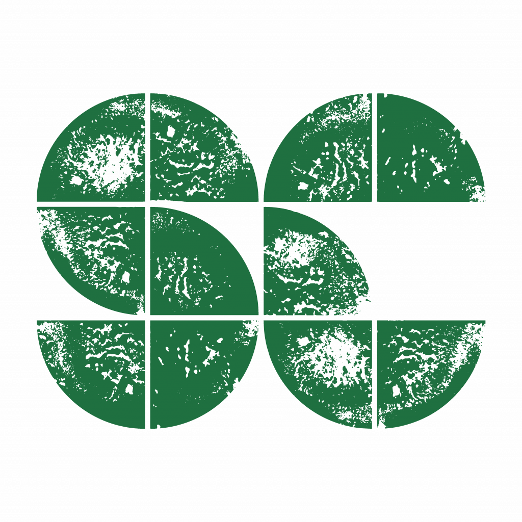
Original design
Pattern abstracted into segments
New texture developed
New segments created from the texture
New design
Potato printing is a craft which many of us did as children. It is accessible and provides so many outcomes from a single origin. This was the perfect way to get started. I sat down with potatoes, paint and some Scavenged paper. And so, a new logo was made from my kitchen. When printing, I used the segments from the previous design and cut the potato into quarters.
This was an element which I felt conveyed both words of Scavenger Collective and I wanted to carry this into the next design. After scanning and digitalising them, I combined the best results in the same way to create the familiar ‘SC’ shapes.
The colourway used in the branding of Scavenger Collective had become so incorporated into our identity. I knew that I wanted these to remain more or less the same. However I didn’t want the yellow to look like a second colour, but act as an off-white. By making this paler and changing the green to a darker, slightly colder colour, there was more contrast.


The final animation used in the previous logo was also very easy to layer over videos and photos for motion graphics. I replicated this as well, but staggered the segments rotating per frame. We decided the motion graphic as a frame-by-frame animation portrays the act of Scavenging well. The segments gradually rotating together like puzzle pieces is symbolic of the storytelling,
gathering and problem solving that is so innate and present in our practice.
